Developed for Sullivan
Crown Castle ESG Charts
Crown Castle's sustainability pages report emissions, renewable energy, workforce and safety as charts. At Sullivan I built them as one component family driven by JSON files, so adding a reporting year or a new metric is a data edit rather than new chart code. Sullivan delivered the front end; a separate vendor integrated it.
The component API
Every chart on these pages is the same component, selected in markup:
<div data-js-component=”Charts” data-json=”donut-renewable-energy-progress”>
The attribute names a JSON file; the component reads it and renders. Adding a metric meant adding a data file and one line of markup — no new chart code, and nothing for the integrating vendor to wire up by hand. Those attributes are still in the page source today.
One family, several layouts
The family covers a bar chart, single, double and triple donuts, a donut paired with its data table, and a standalone table. Each metric picks a layout; the rendering, the year handling, and the table markup are shared. What differs between an emissions donut and a safety bar is the data file, not the code path.
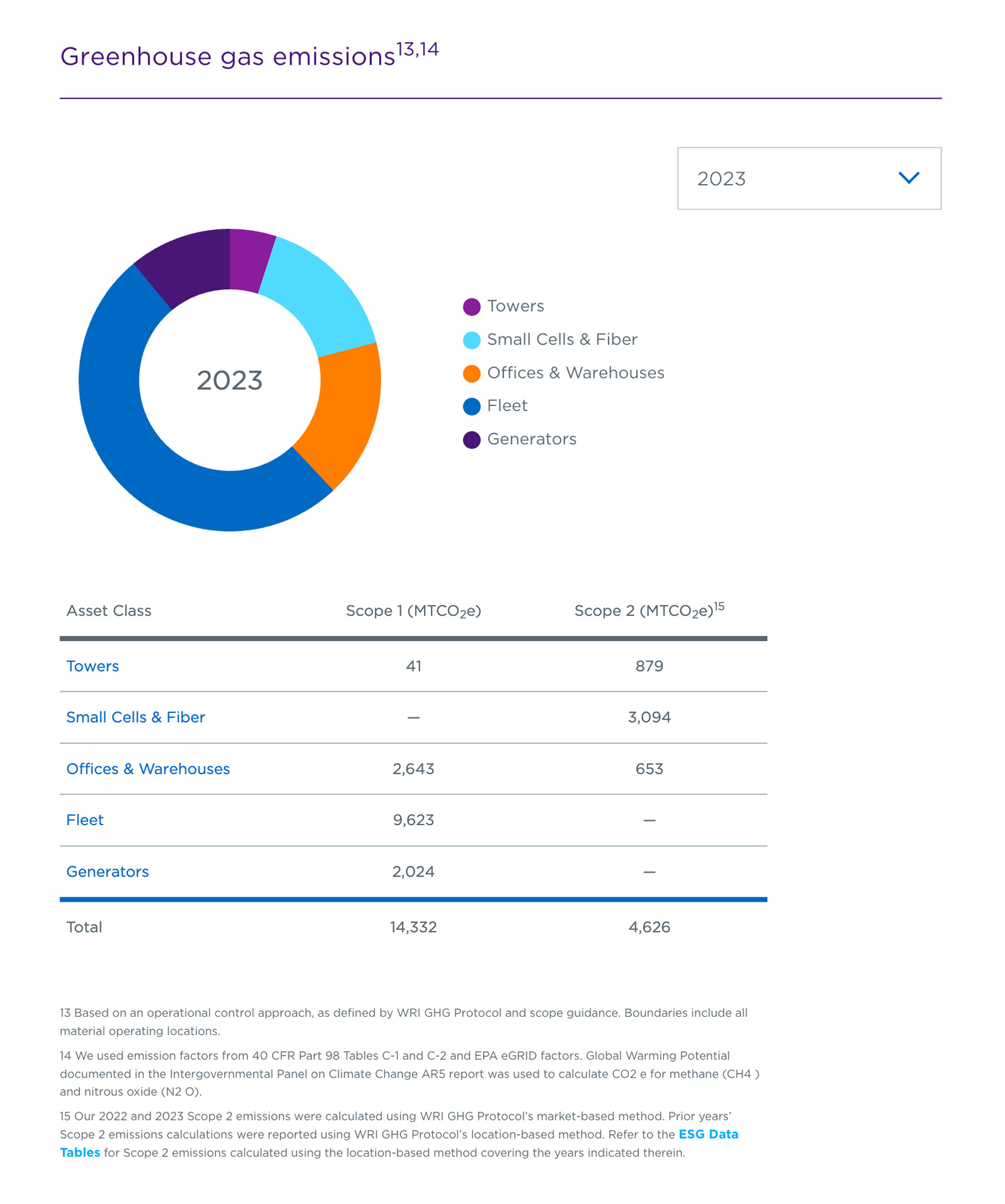
Three reporting years live in one file as three datasets, all but one hidden. The select swaps which dataset is visible rather than fetching anything, and the table below is tied to the same file by a hasMatchedTable flag, so it moves with the chart.
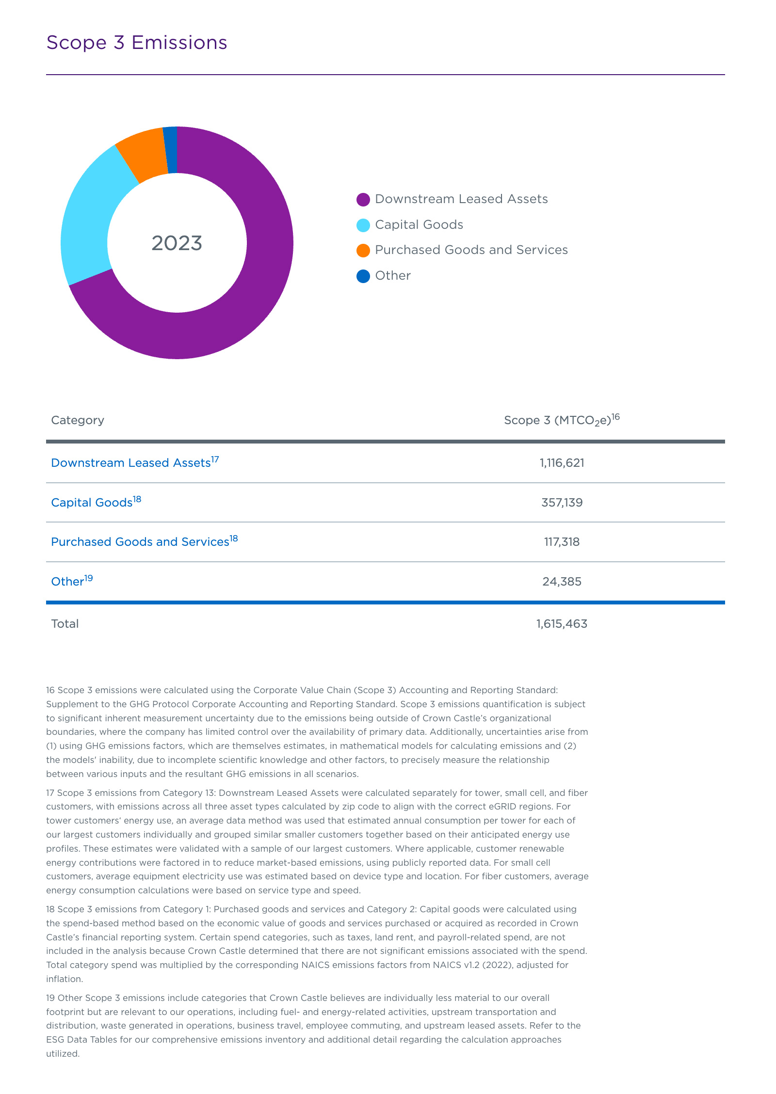
The same donut-and-table layout, captured with a single reporting year and no select. The control is not part of the layout — it comes from a years array in the file, so a metric gains a year picker when the data gains a year.
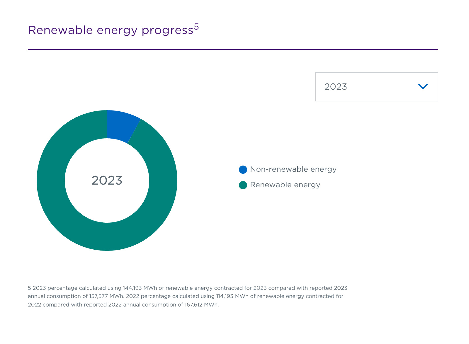
The table is optional: this file leaves the hasMatchedTable flag out and the same donut renders without one. Two segments here against five in the emissions donut — labels, values, and the color of every segment come from the file.
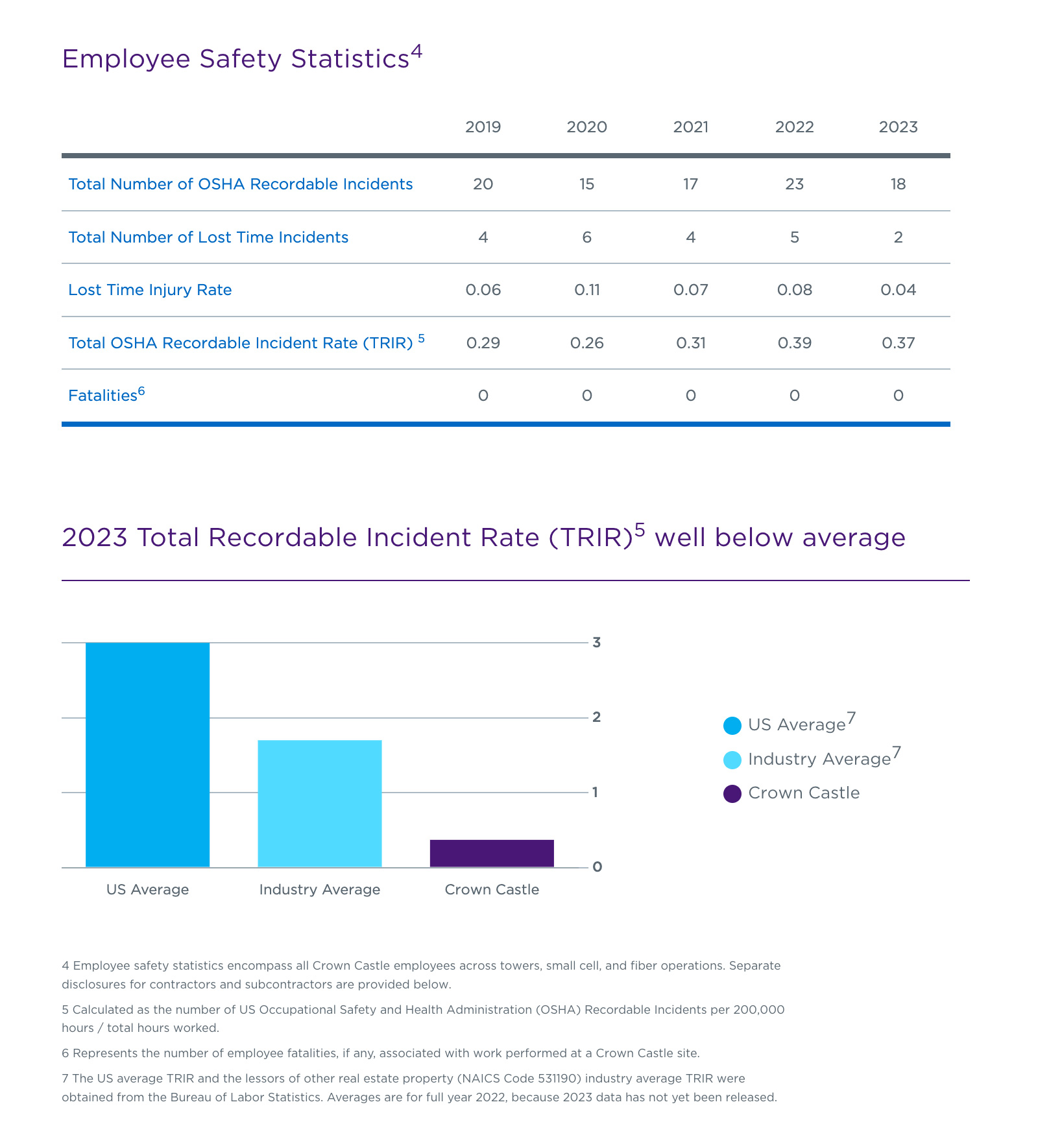
Here the table stands on its own, and the bar below it has no years array at all: three fixed values, no picker. The same component with less data in front of it.
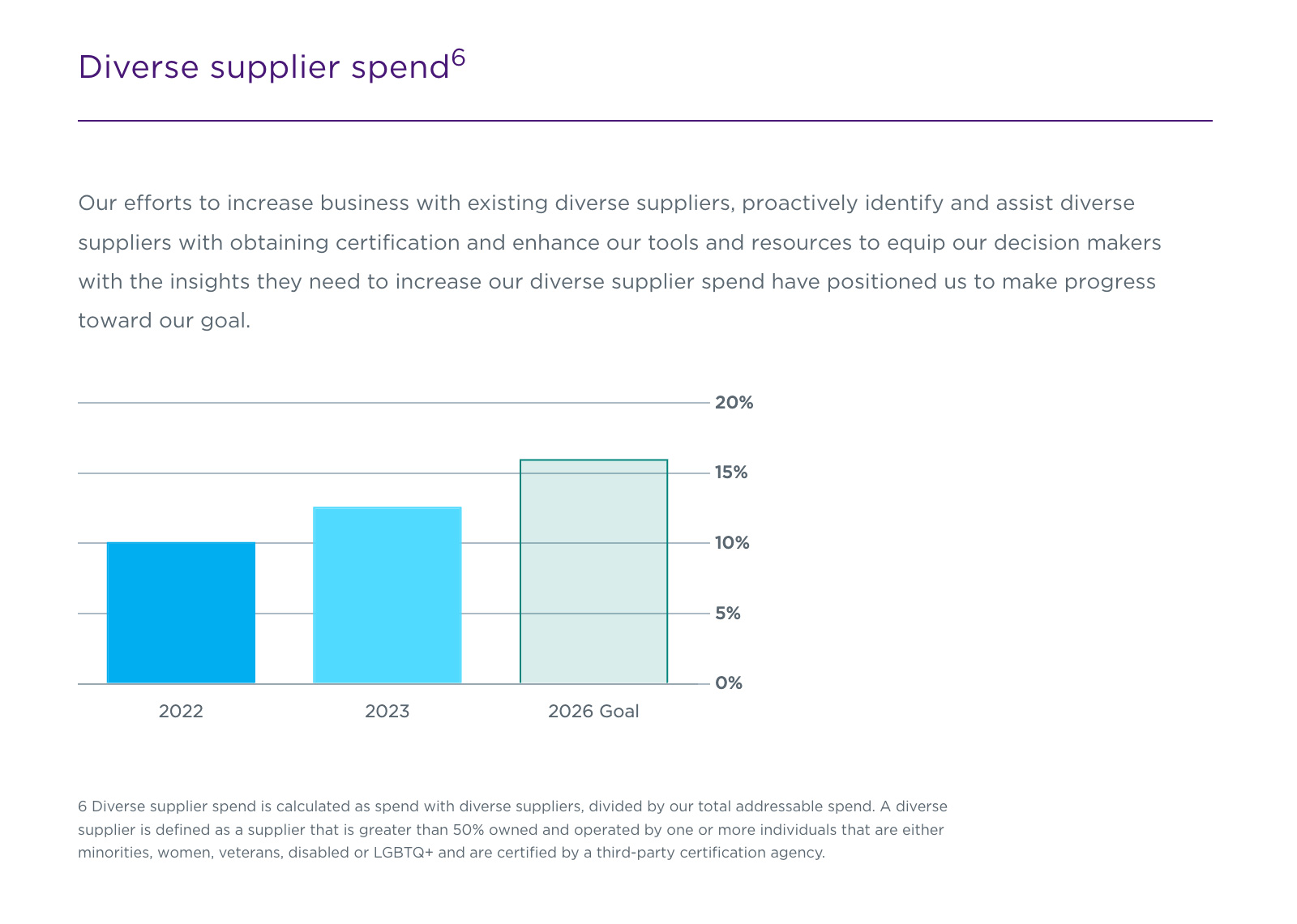
Two reported years and a 2026 goal in one bar chart. The goal is not a special case in the code — it is the fourth value in the same array, given a translucent fill and a dashed border in the data so it reads as a target rather than a result.
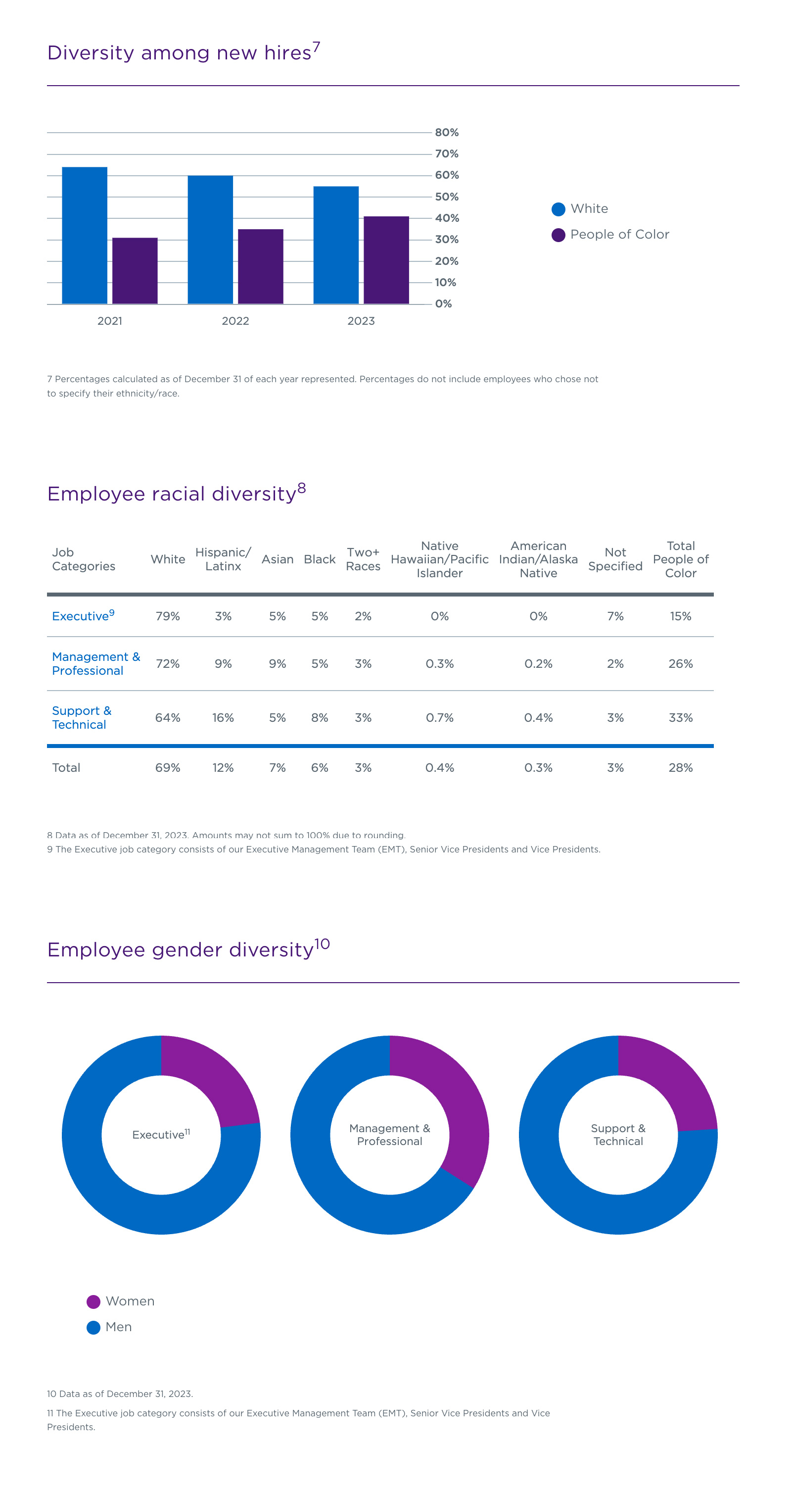
The triple donut is one file holding three chart objects: charts is an array, so a layout with three donuts side by side needs no new component. Beside it, a grouped bar of two series and a ten-column table — three layouts on one page.
Data as the interface
JSON files hold the numbers, one per metric. Where a metric has more than one reporting year, the file carries a years array and the component renders a select above the chart; each year is a hidden dataset inside the same chart, so switching years shows a different dataset instead of fetching anything. Adding next year’s figures means adding a dataset to a file.
Handoff
Sullivan built the front end; the back end and the CMS integration belonged to another vendor. I handed over markup, styles, and the chart scripts from a Gulp and Nunjucks build, with the shape of each JSON file as the contract between us. It is the same problem a design system team has — hand over something another team assembles without you in the room.