Developed for Sullivan

Pantheon

Pantheon is a global private markets investment firm with $70B+ in AUM across private equity, infrastructure, real assets, and credit. At Sullivan I built the global navigation, the homepage motion, and the Vue post system behind News, Insights, Events, and Team.

Role
Front-end development (design by Sullivan)
Stack
JavaScript · Vue · GSAP + ScrollTrigger · SCSS · Twig · WordPress
Built
Global navigation with keyboard-operable dropdown submenus; homepage hero and scroll-activated body sections with mobile-specific layouts; Vue post hub filtering News, Insights, and Team by topic, year, office, and department; post detail templates; tag-based discovery and search results

Global Navigation

The main menu opens its submenus on click, not hover, so the same interaction works with a mouse, a keyboard, and touch. Submenus are reachable and operable with Tab and Enter; the underline animation sits on top of that rather than being the thing that reveals the menu. The bar reflows to a mobile menu at narrow widths.
Post Hub Template

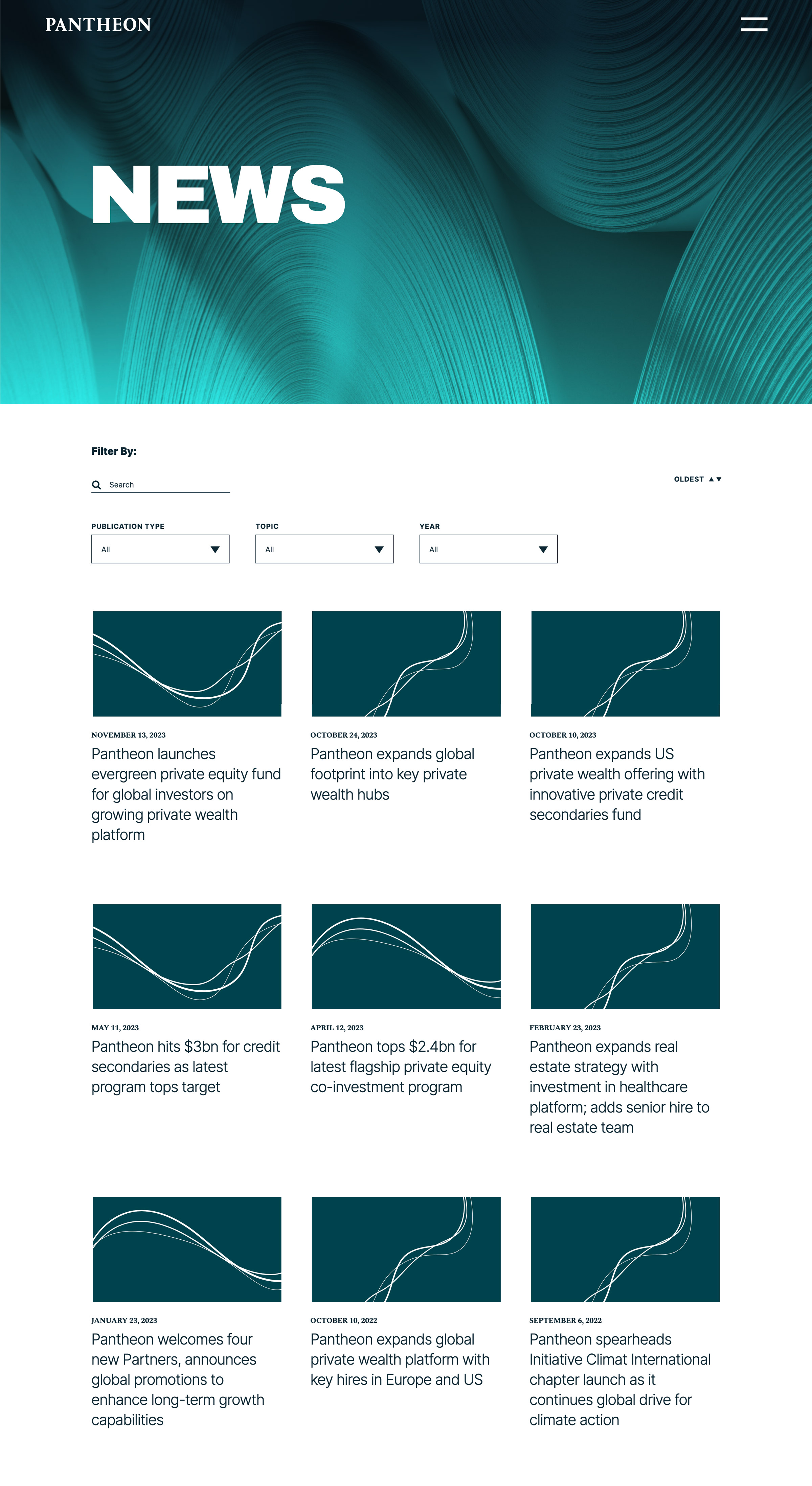
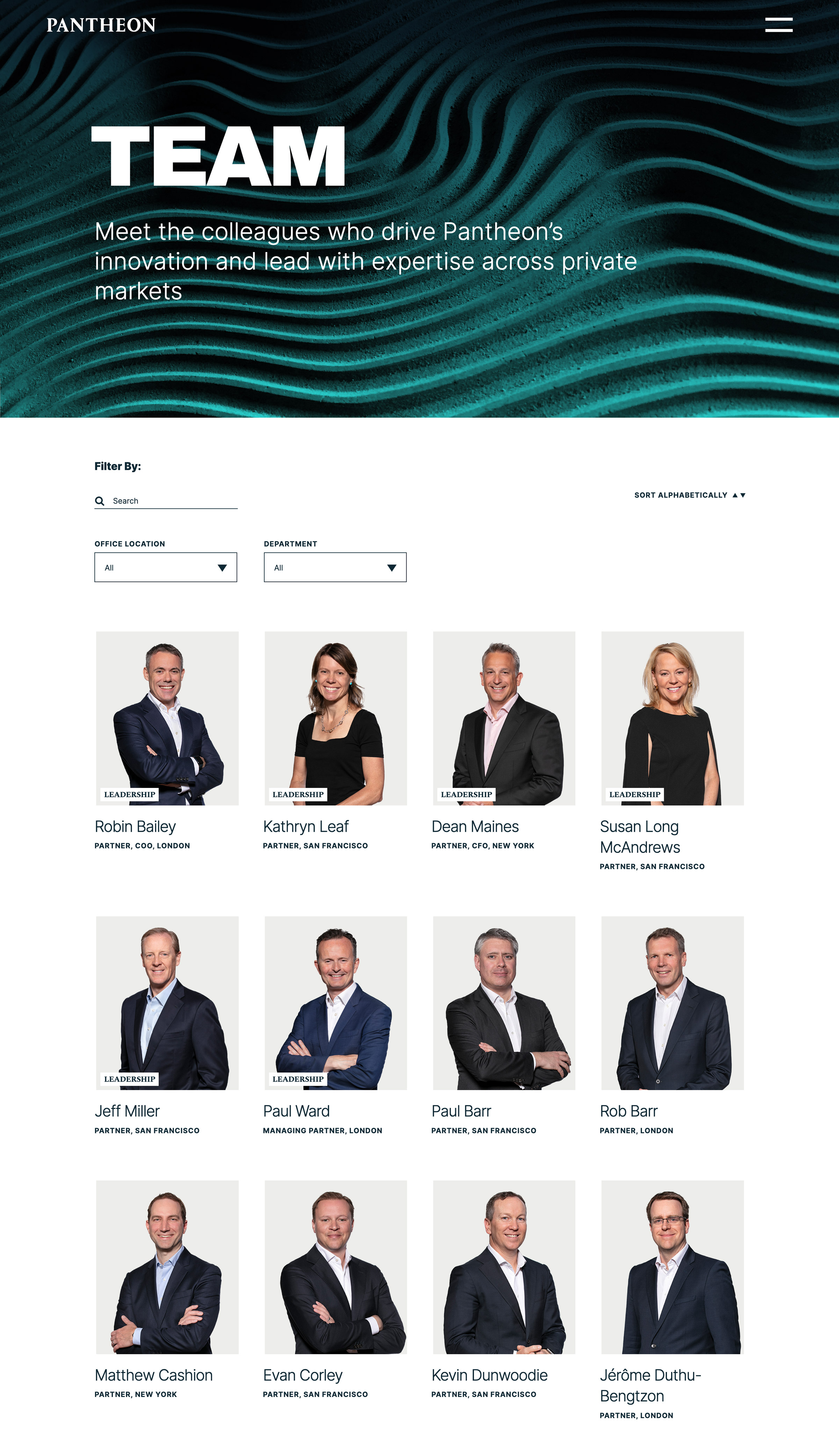
One template drives the News, Insights, and Team listings. I built the filtering in Vue — readers narrow a list by topic, year, office, or department, and the filters combine. Adding a content type meant adding data, not another template.

The News listing: a filter bar with a search field and Publication Type, Topic, and Year dropdowns, above a three-column grid of dated article cards.
The Team listing on the same template, with a different filter set — search, Office Location, and Department — above a grid of people cards showing name, title, and office.

Detail Templates

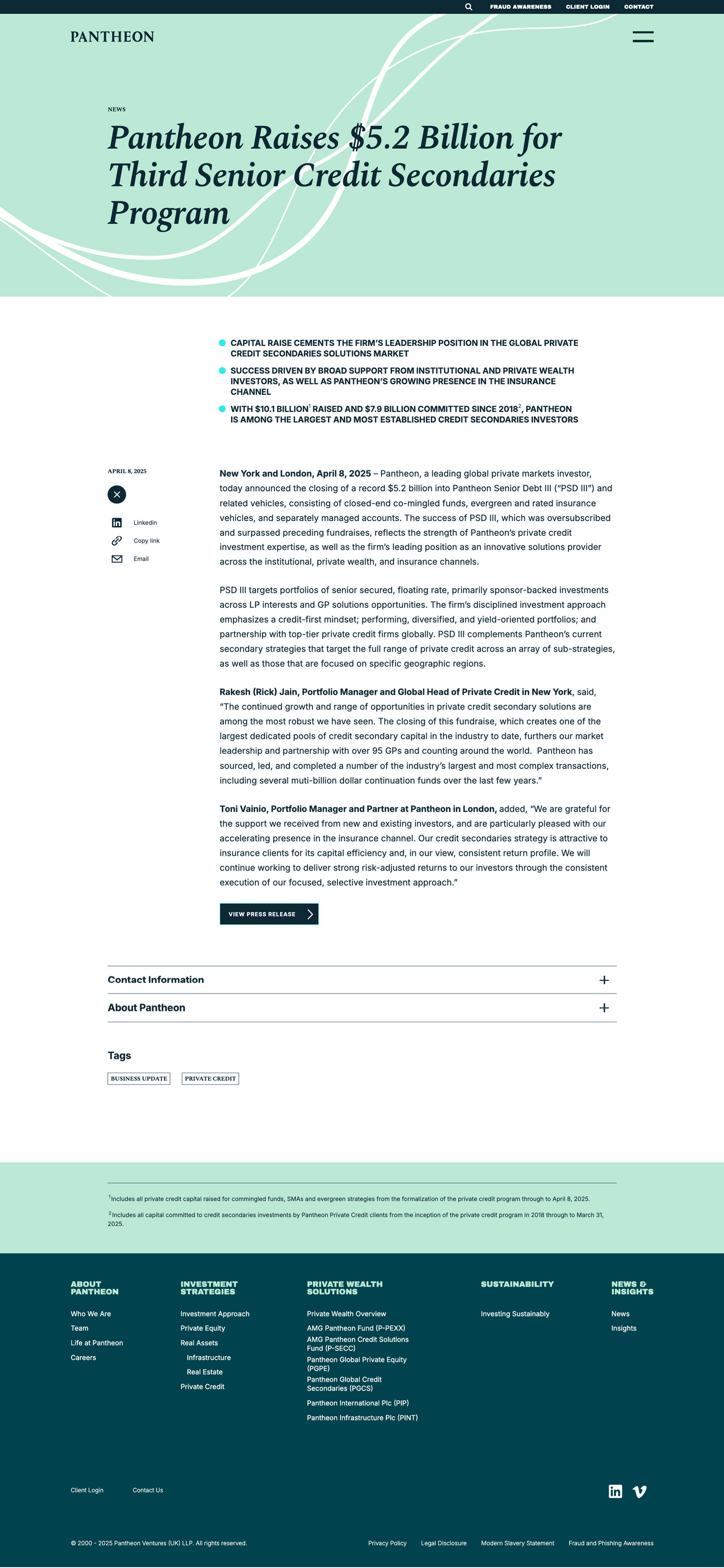
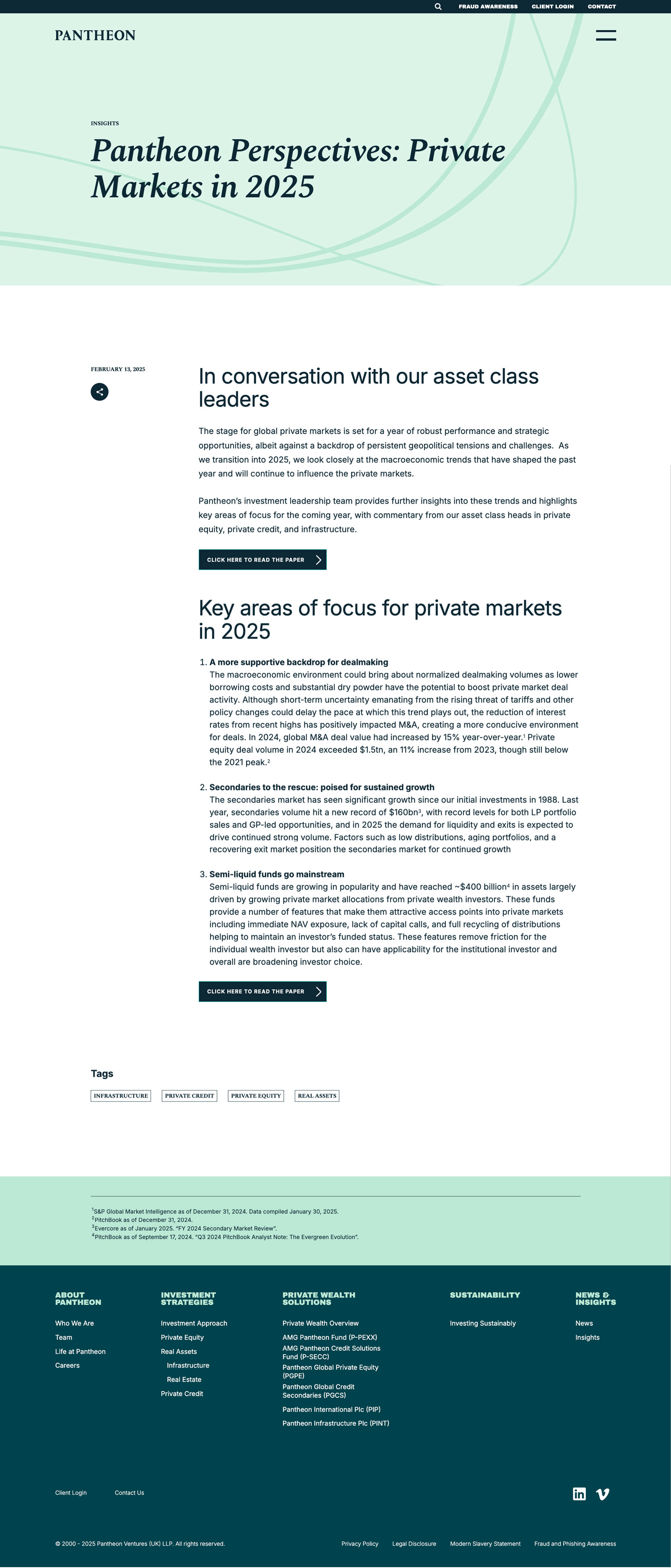
News, Insights, Events, and Team each get their own detail template rendered from the same CMS fields. News and Insights carry a share group — LinkedIn, email, and copy link.

A News article: the headline over a tinted hero, a summary list, and body copy, with the share group open in the left margin showing LinkedIn, copy link, and email. Collapsed panels and a row of tags close the page.
An Insights article on the same shell, with the share group collapsed to a single button. Numbered sections and download buttons sit above a row of four tags.
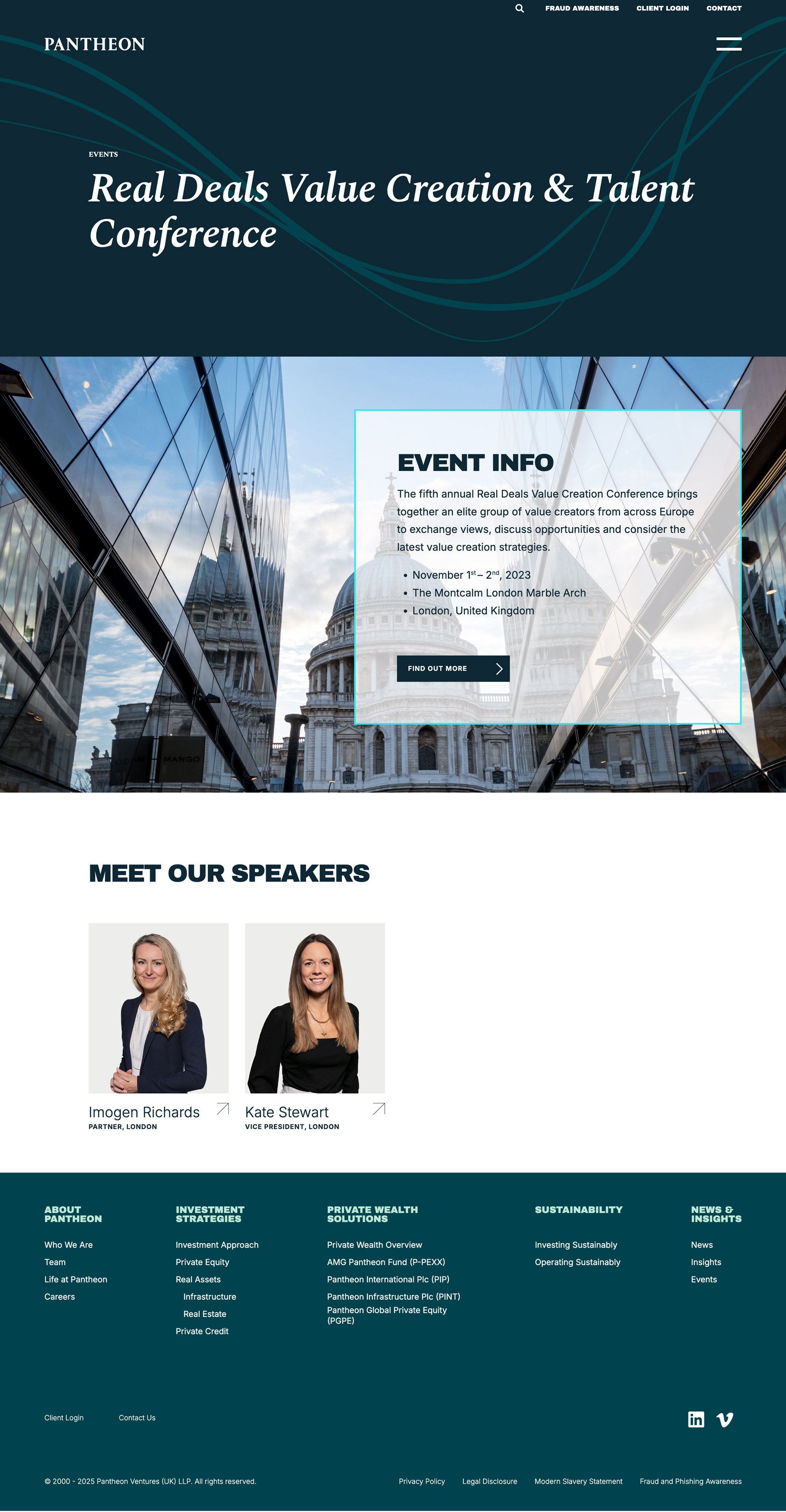
An Events page: a venue photograph with an event-info card laid over it carrying dates, venue, and city, followed by a speakers row of linked people cards.
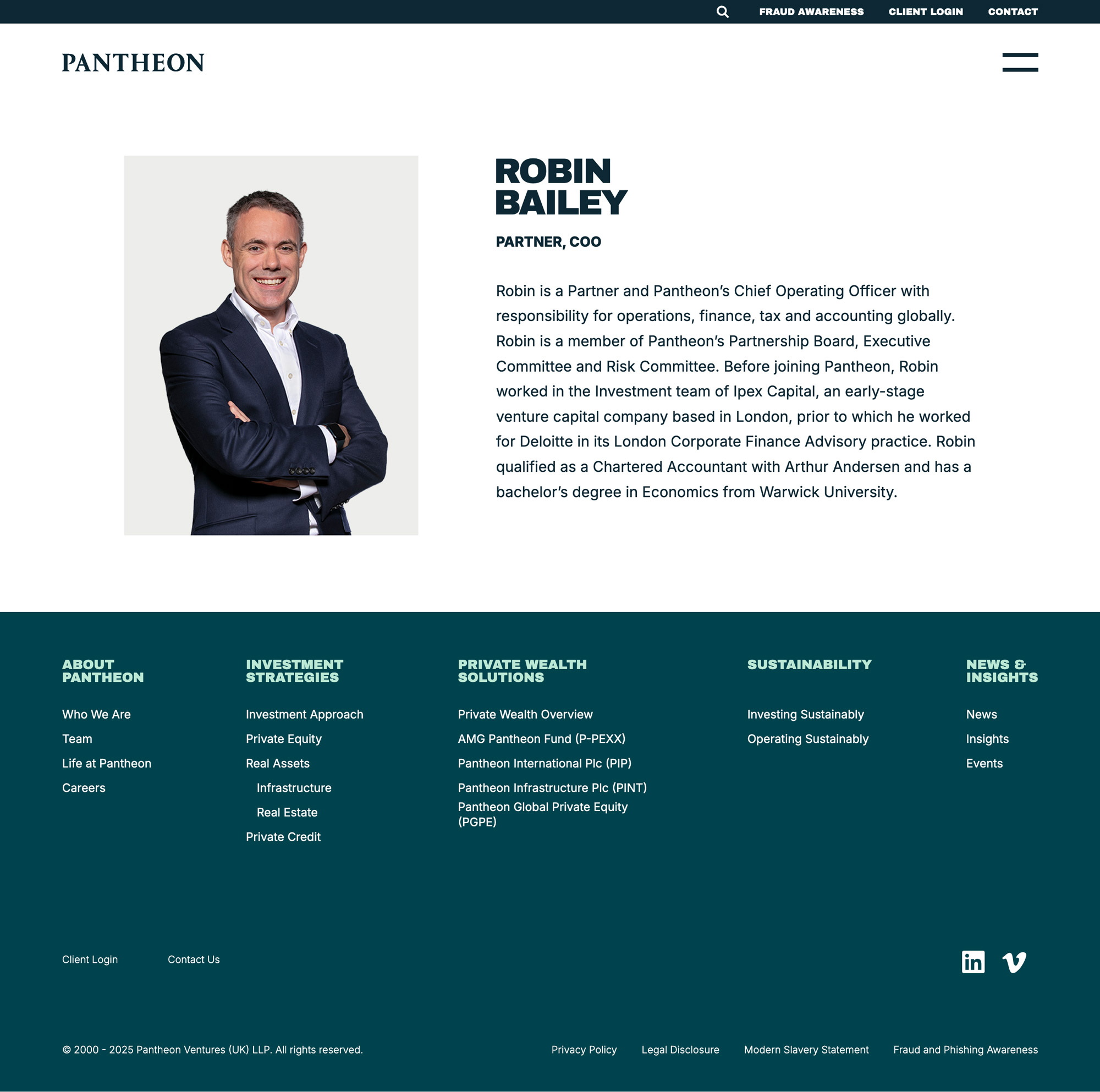
A team member page: portrait on the left, then name, role, and a biography — the same person record that appears as a card in the Team listing.

Tags & Search

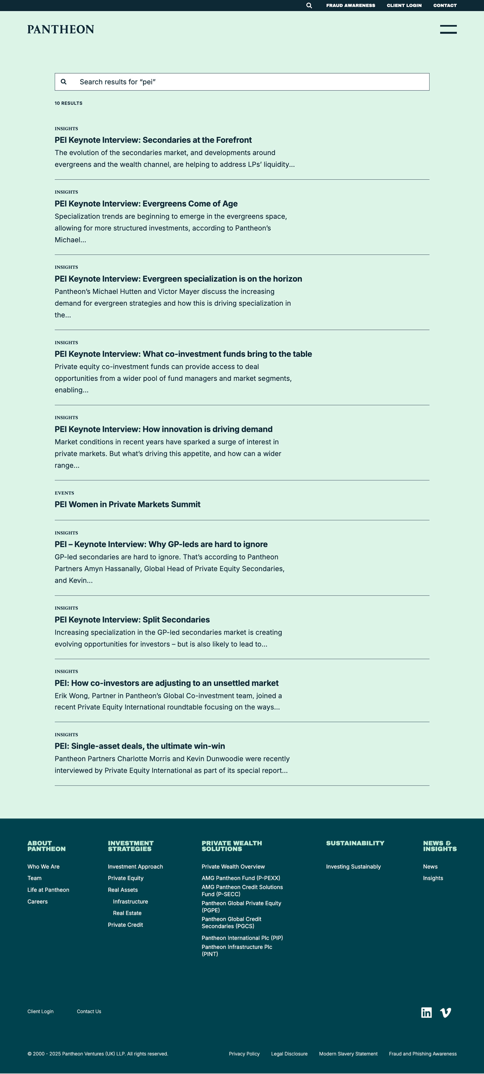
Articles are reachable two ways: global search returns results across post types, and every tag on an article links to a filtered archive for that term.
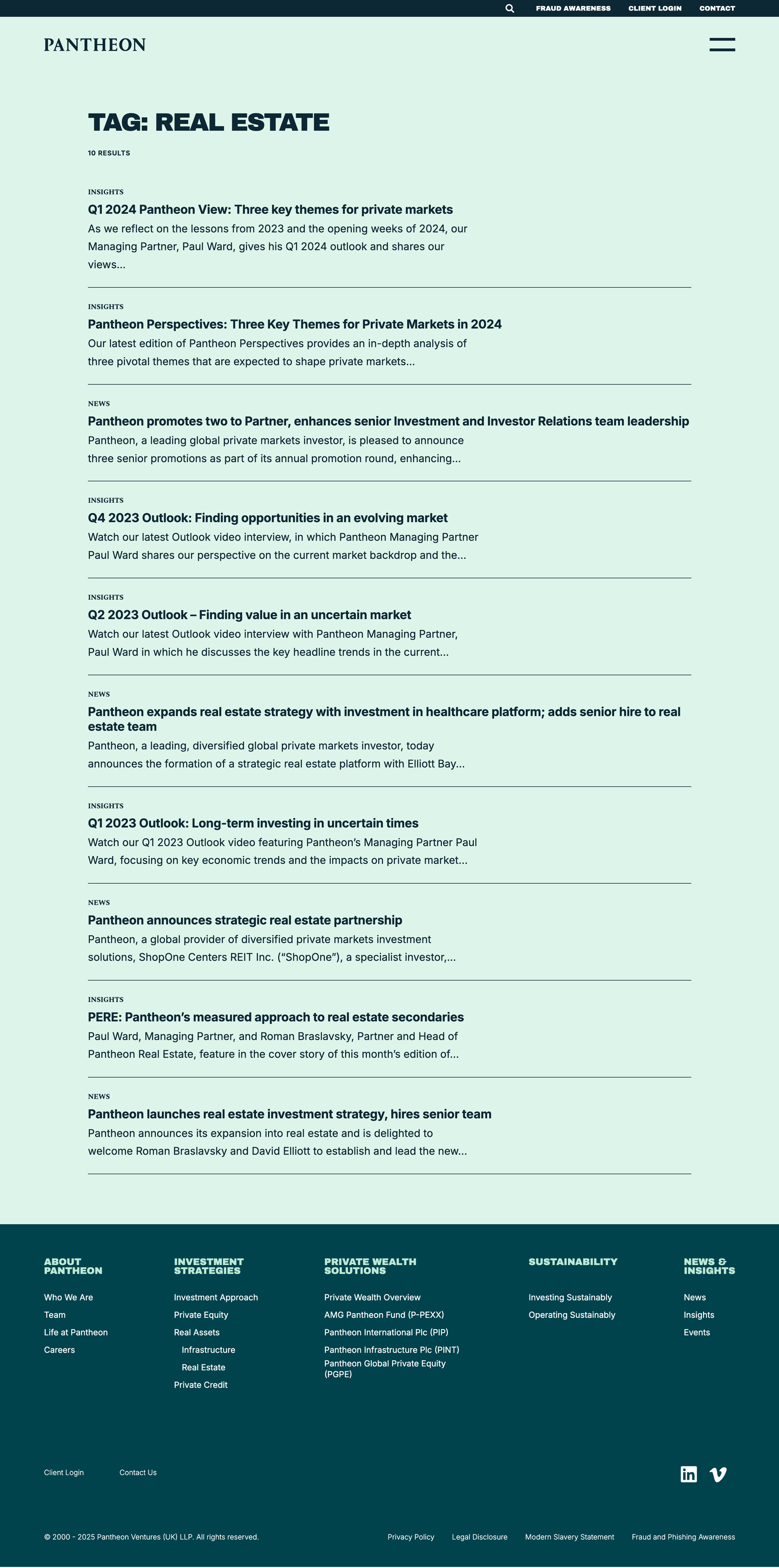
A tag archive headed
Search results for a single term, using the same result rows. The post-type label on each row shows the search reaching across Insights, News, and Events.

Timeline Component

The company history timeline can be driven two ways: drag the wheel, or pick a year from the dropdown. Both paths move the same state, so the component does not depend on a drag gesture — the copy and the background image update together on each change. On mobile the wheel is laid out for touch.

Desktop View

Mobile View

Homepage hero & scroll sections

I built the homepage hero and the scroll-activated body sections with GSAP and ScrollTrigger. Each section is bound to its own trigger, so content reveals as it enters the viewport rather than on a fixed timer. Several sections use a different arrangement on mobile — a separate layout of the same components, not a scaled-down desktop.
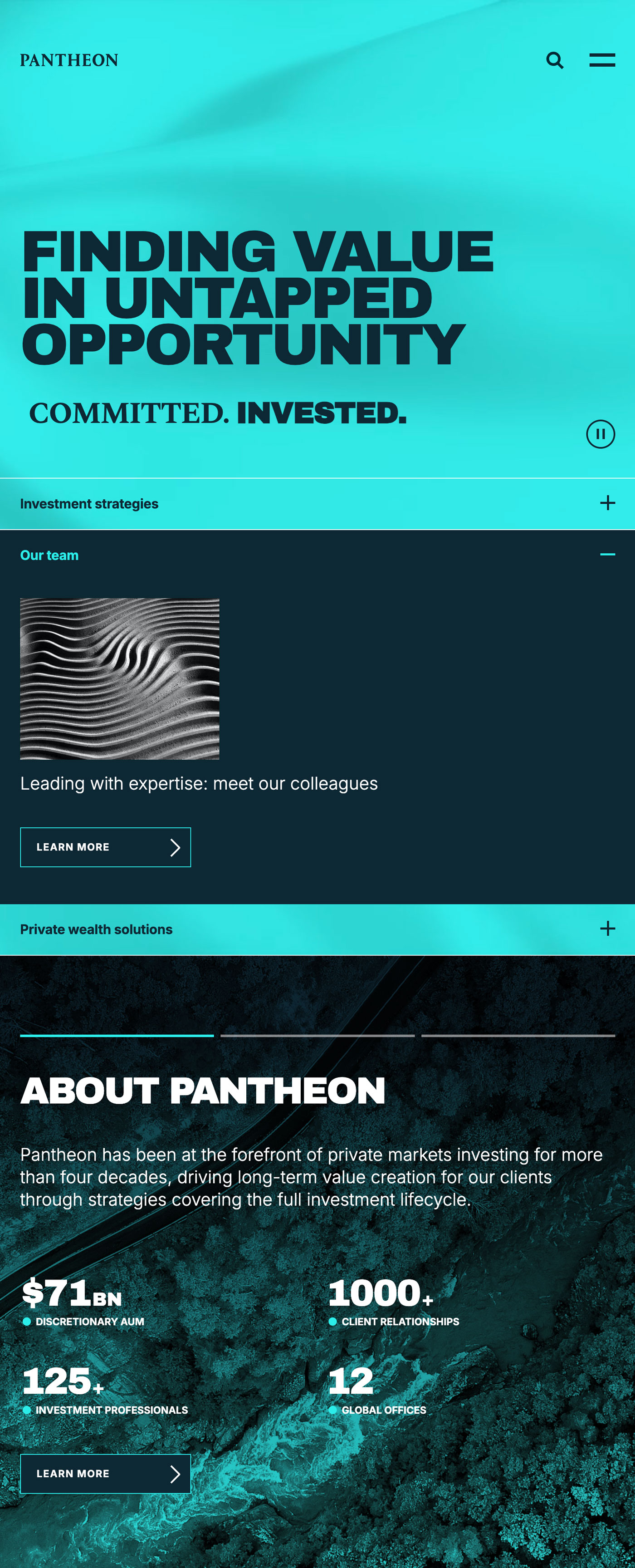
The homepage on a phone: the hero headline over video, then the body sections stacked as an accordion with one panel open showing its image, text, and link, and an About block with four figures.

Mobile View

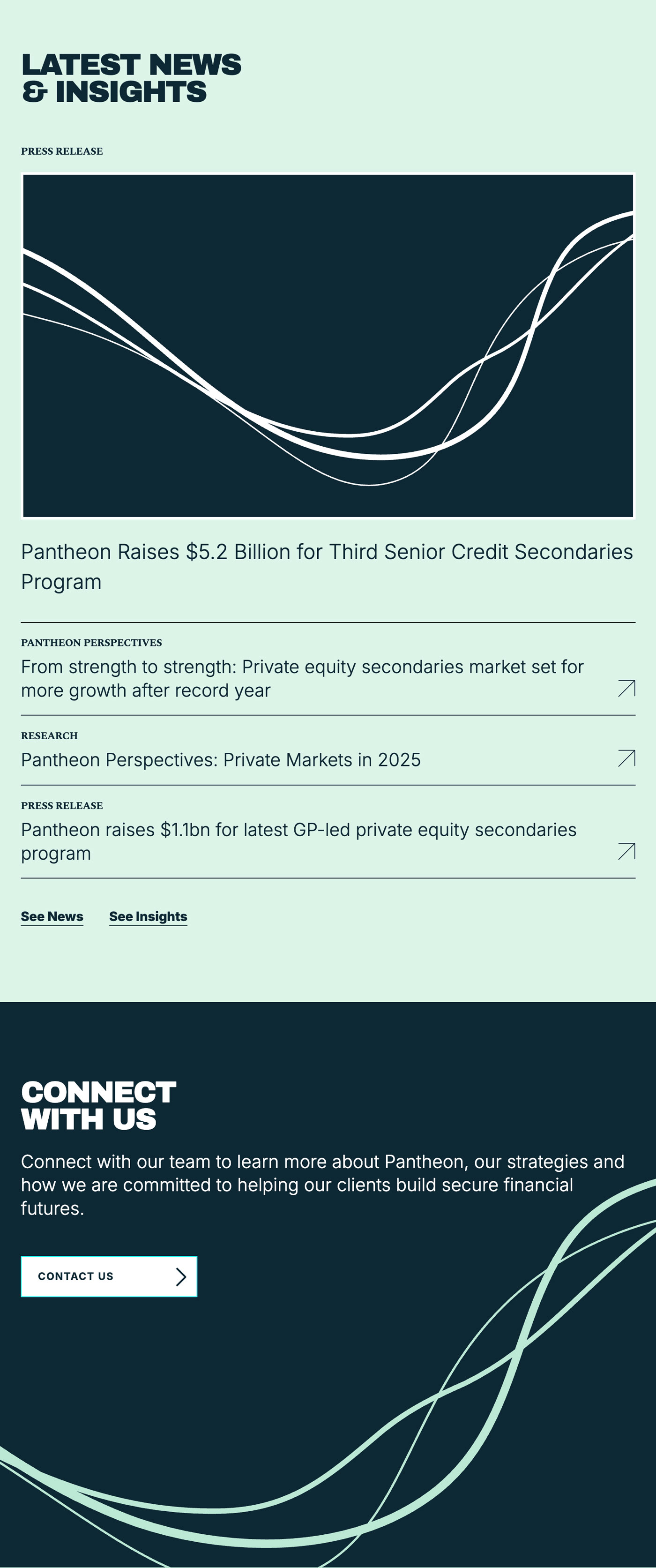
Further down the same phone layout: a featured news card, then three rows labelled by content type, and a closing contact block.

Mobile View

Editor-configured components

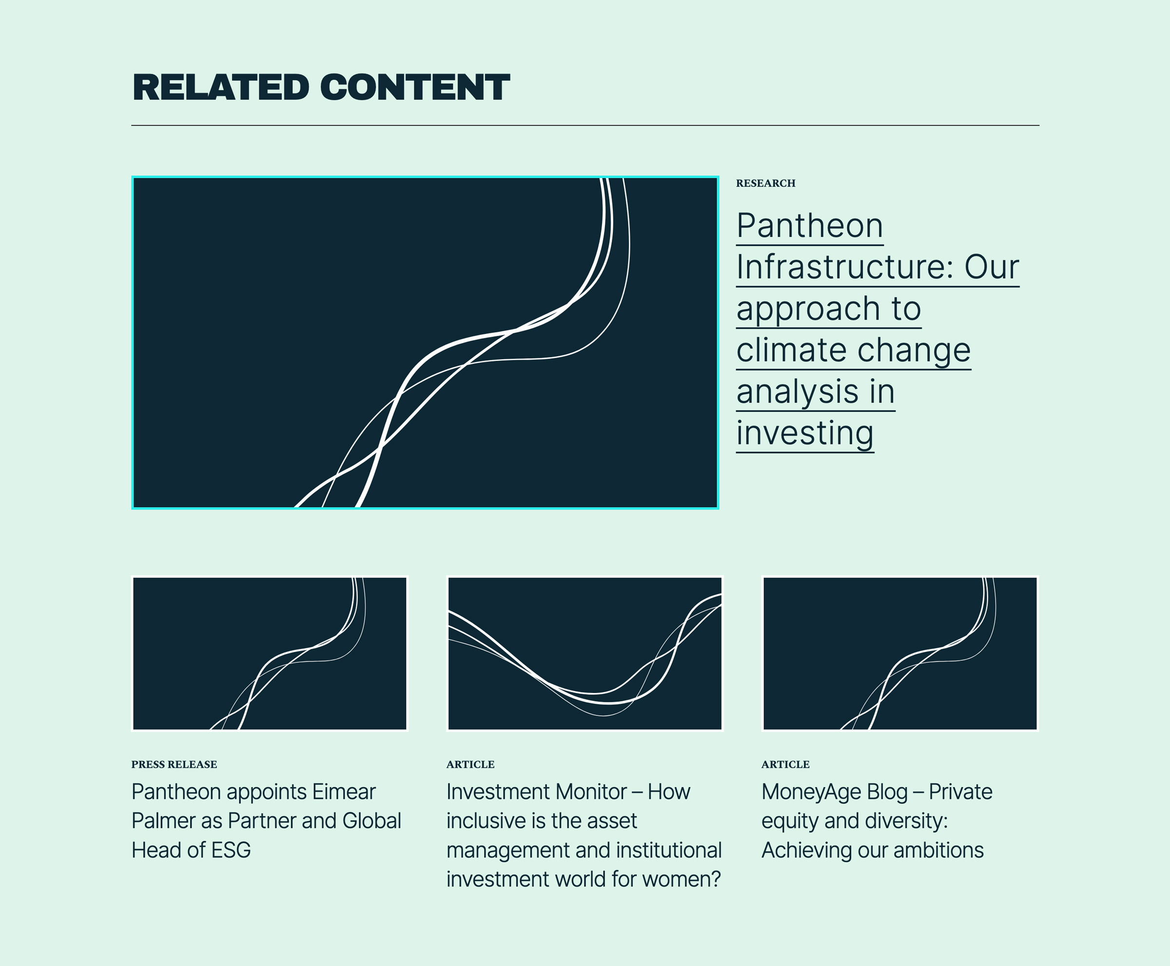
Three components let an editor assemble a page without a developer: a leadership grid where each tile links to that person’s detail page, a related-content row curated per page, and an accordion holding 10+ office locations where each city name toggles its own panel.
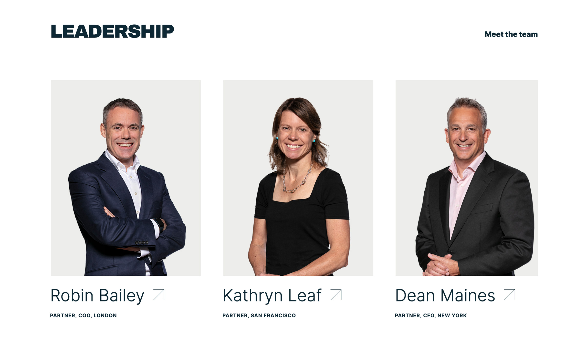
The leadership grid: three tiles, each with a portrait, a name carrying a link arrow, and the person's title and office.
The related-content row: one featured item with a large thumbnail, then three smaller cards, each labelled with its content type.
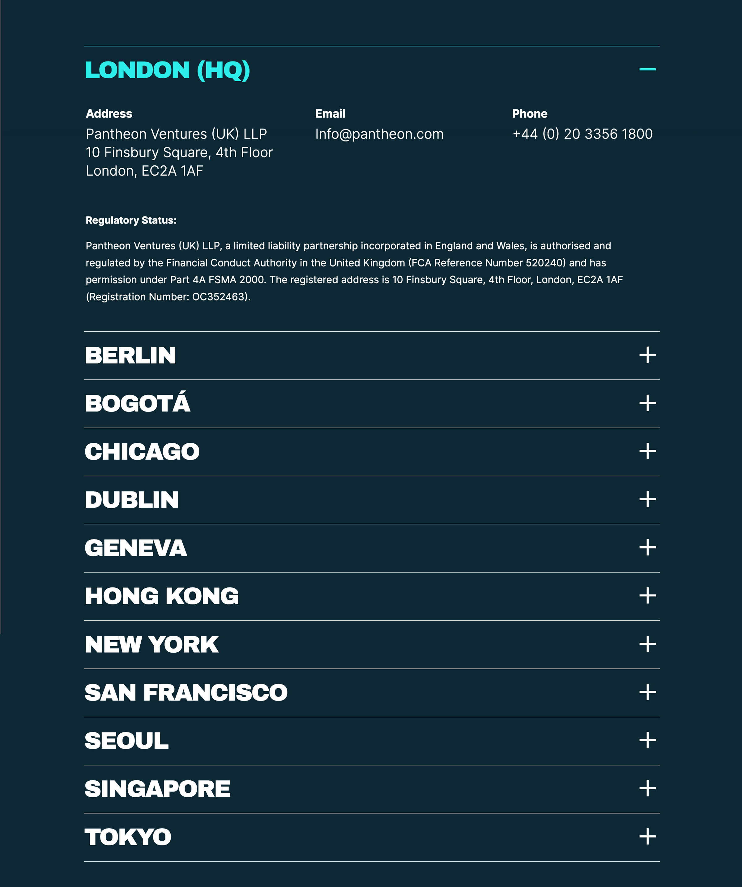
The office accordion with the London panel open, showing address, email, and phone in columns above eleven collapsed city rows, each with its own toggle.