Developed for Sullivan
Two Sigma
Two Sigma is a New York-based hedge fund known for applying scientific and engineering principles to finance. I led the front end of their corporate site for three years, through a third-party WCAG 2.1 AA audit and the component work below.
Third-Party Accessibility Audit
Two Sigma brought in Allyant to audit the site against WCAG 2.1 AA. They filed findings ranked by severity; I worked through the front-end remediation and sent each fix back for re-review until the site passed.
Global Controls
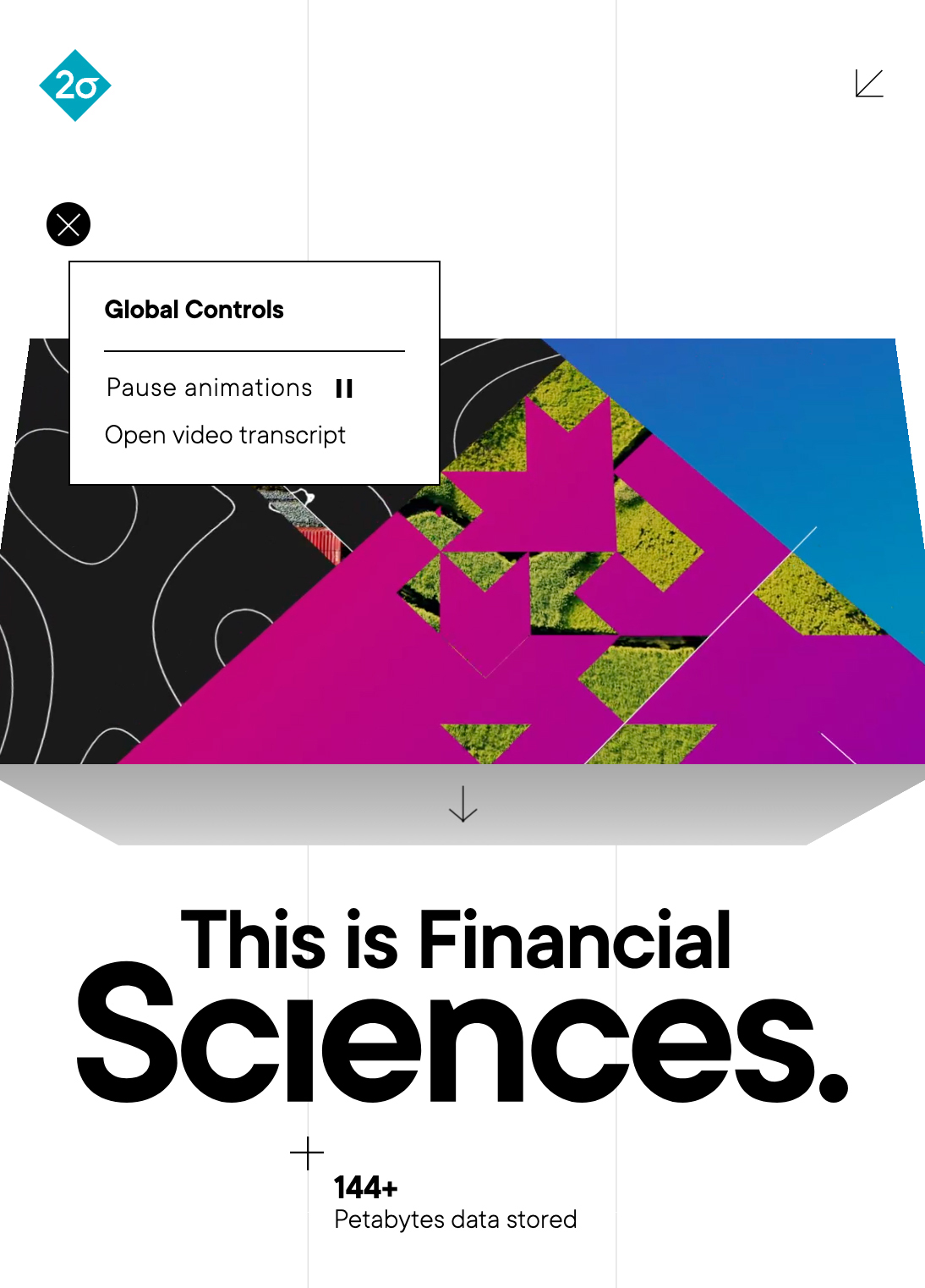
The audit’s motion findings could have been fixed animation by animation. Instead I built one control that every animated component on the site subscribes to — pause it once and everything stops. That’s WCAG 2.2.2 (Pause, Stop, Hide) answered as shared infrastructure rather than a patch per component. The trigger sits in the corner of every page and explains itself on hover.
Everything we built afterward was wired into it from day one — including the 3D hero below, which came after the audit had closed.
Closed — the trigger is the + in the corner. Captured 2025.

Hovering explains it.

Clicking reveals the panel.
Financial Sciences
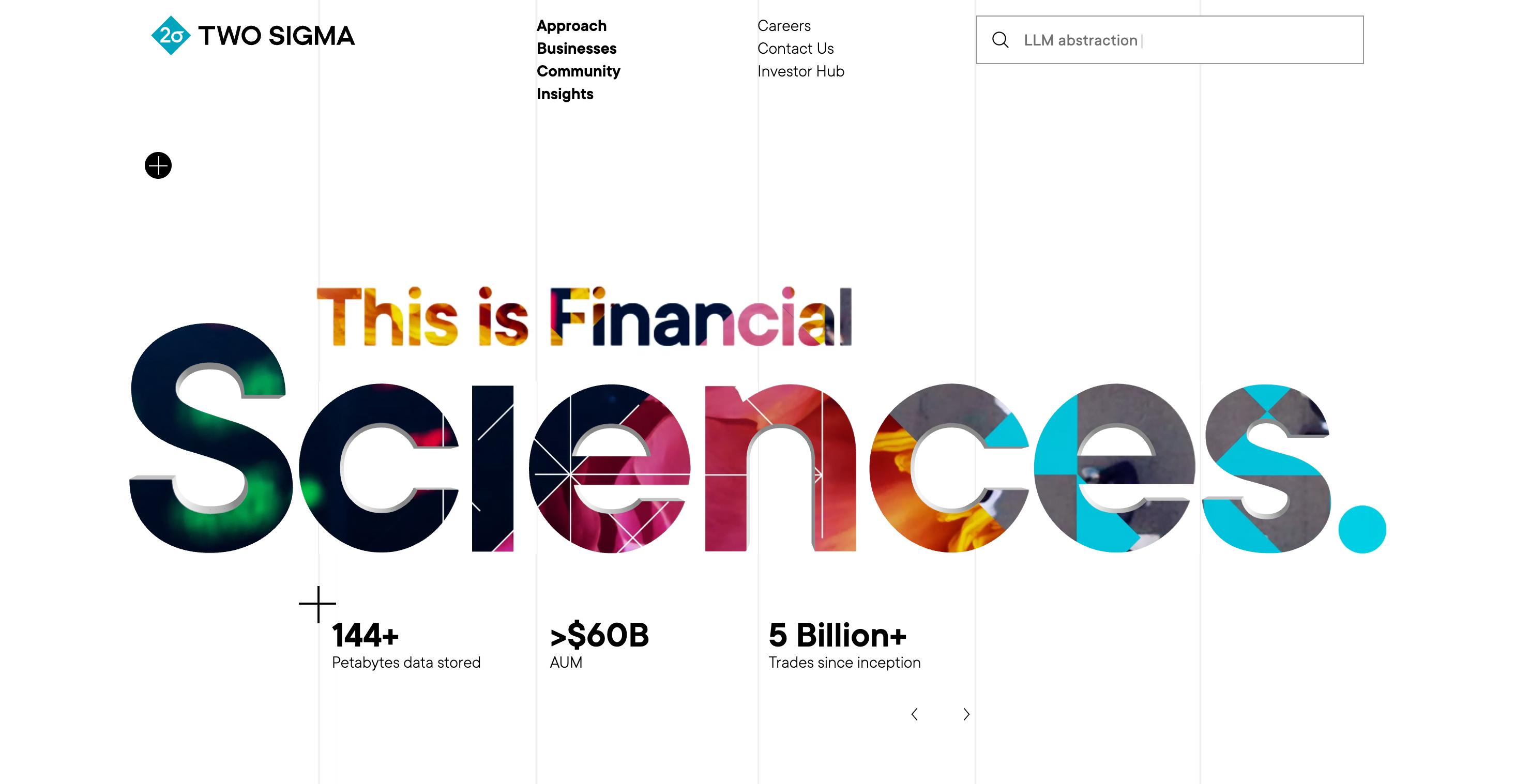
I built the homepage hero in Three.js: the word “Sciences” is eight 3D letterforms, each carrying a video texture. A default video plays across all eight. Hovering a letter switches every letter to that letter’s video, and flips the hovered one so the video plays on its reverse face. The headline stays in the DOM as real text behind the canvas.
Financial Sciences – Mobile
For mobile the team proposed simplifying the hero into a cube — lighter to render and easier to read at that size. I built it with CSS transforms instead of Three.js: a video mapped to each of four sides, rotating as you swipe up or down, with a short swing animation on load to signal that it moves.
Entity Template
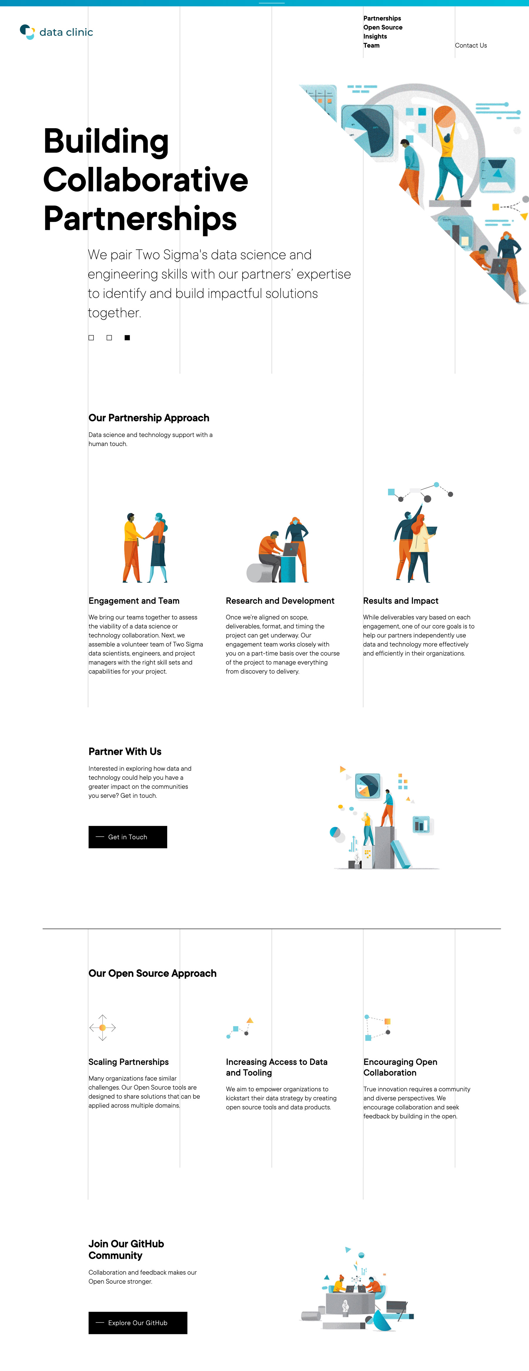
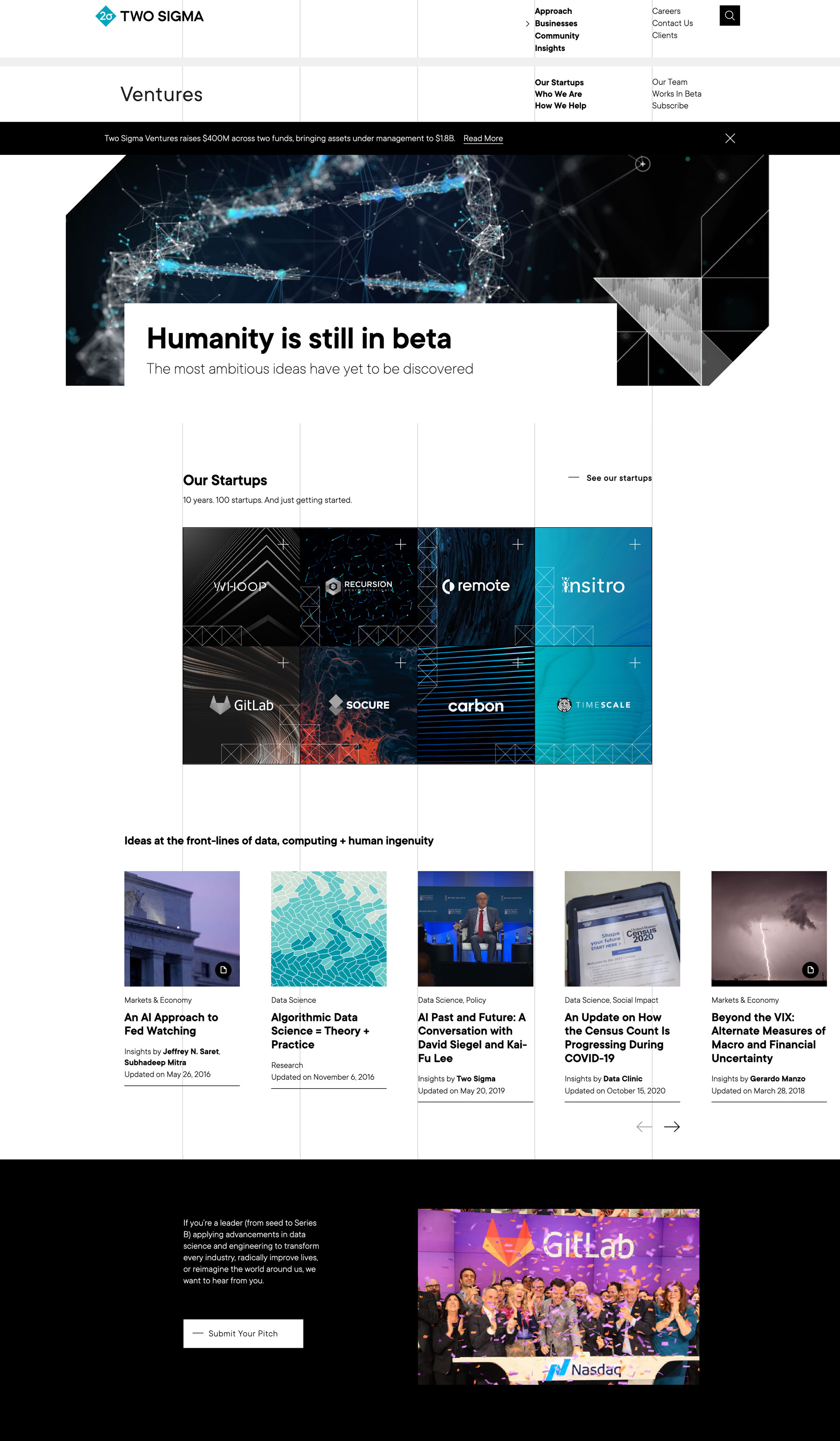
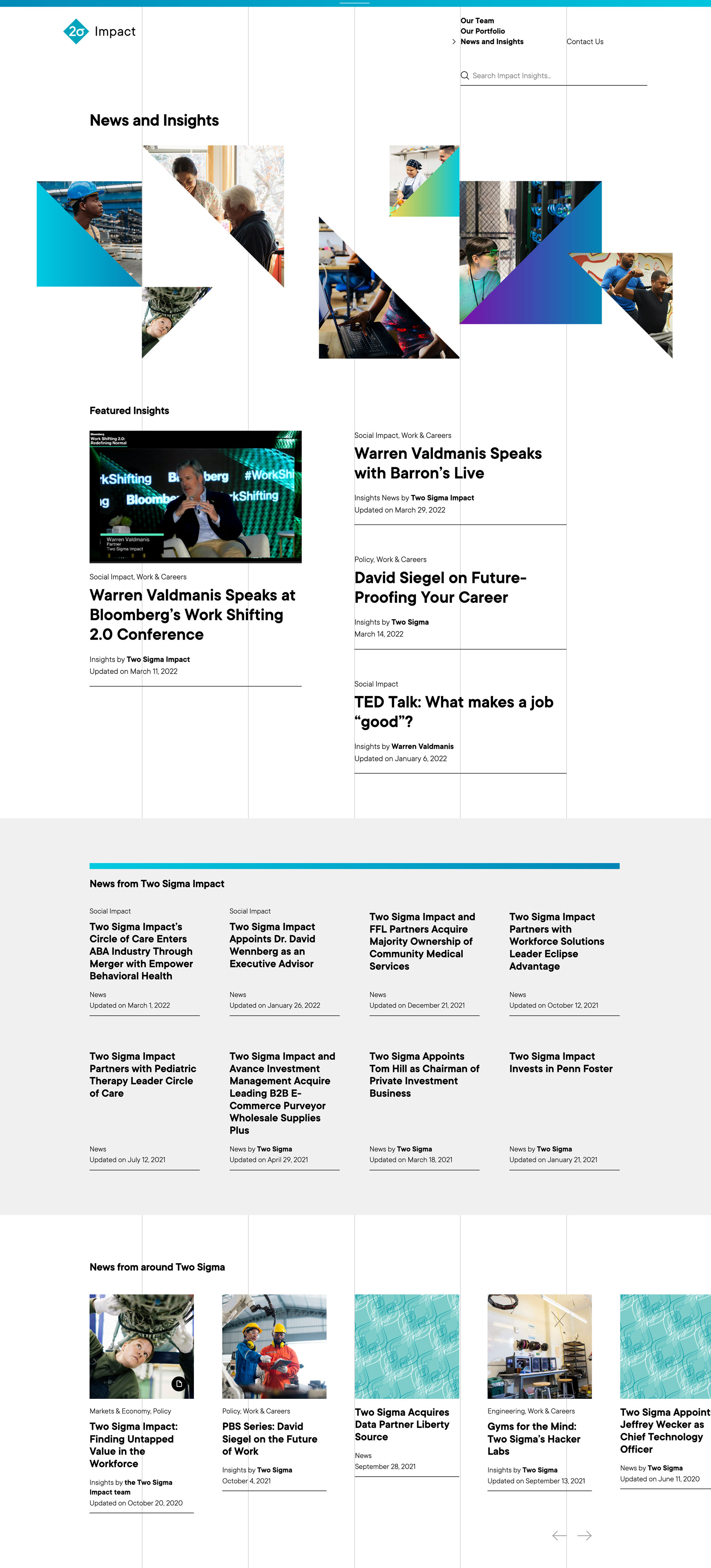
Two Sigma’s business lines — Sightway Capital, Real Estate, Ventures — each needed a presence of their own without becoming separate sites. We built one entity template system: each entity gets its own article archive, team page, and layout options, pulling its own articles, team members, and search results while inheriting the parent brand.
Patchwork Grid
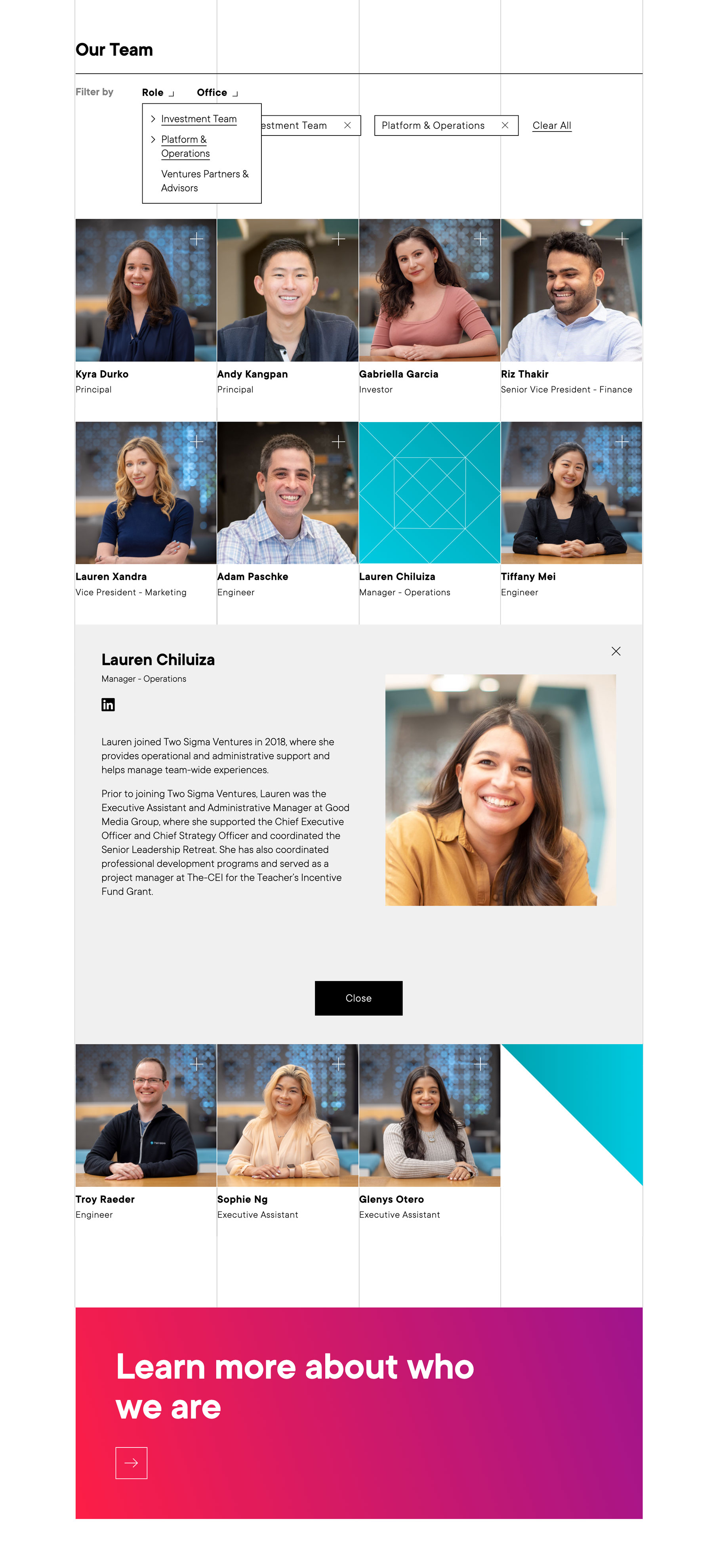
A grid of team members and projects, filterable by role, office, or project type. I built it in vanilla JavaScript against the WordPress REST API (/wp-json/wp/v2/), so filtering never reloads the page; clicking a tile opens the full detail in place.
Article Hub
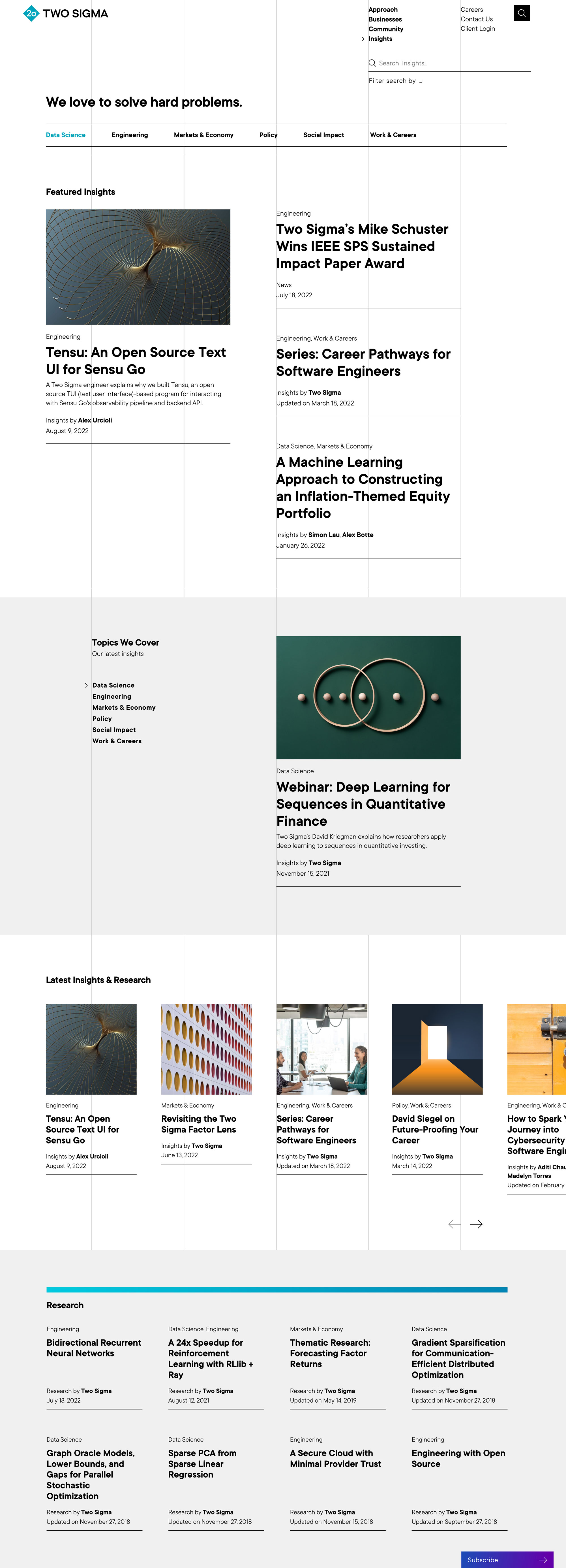
The hub surfaces featured and latest articles, filterable by topic and publisher. Its topic navigation is server-rendered — each filter is a taxonomy term page, so every view has a URL of its own that can be linked and shared. The patchwork grid needed the opposite: filtering with no page load at all. Same site, two different problems.
Scrolling Data Component
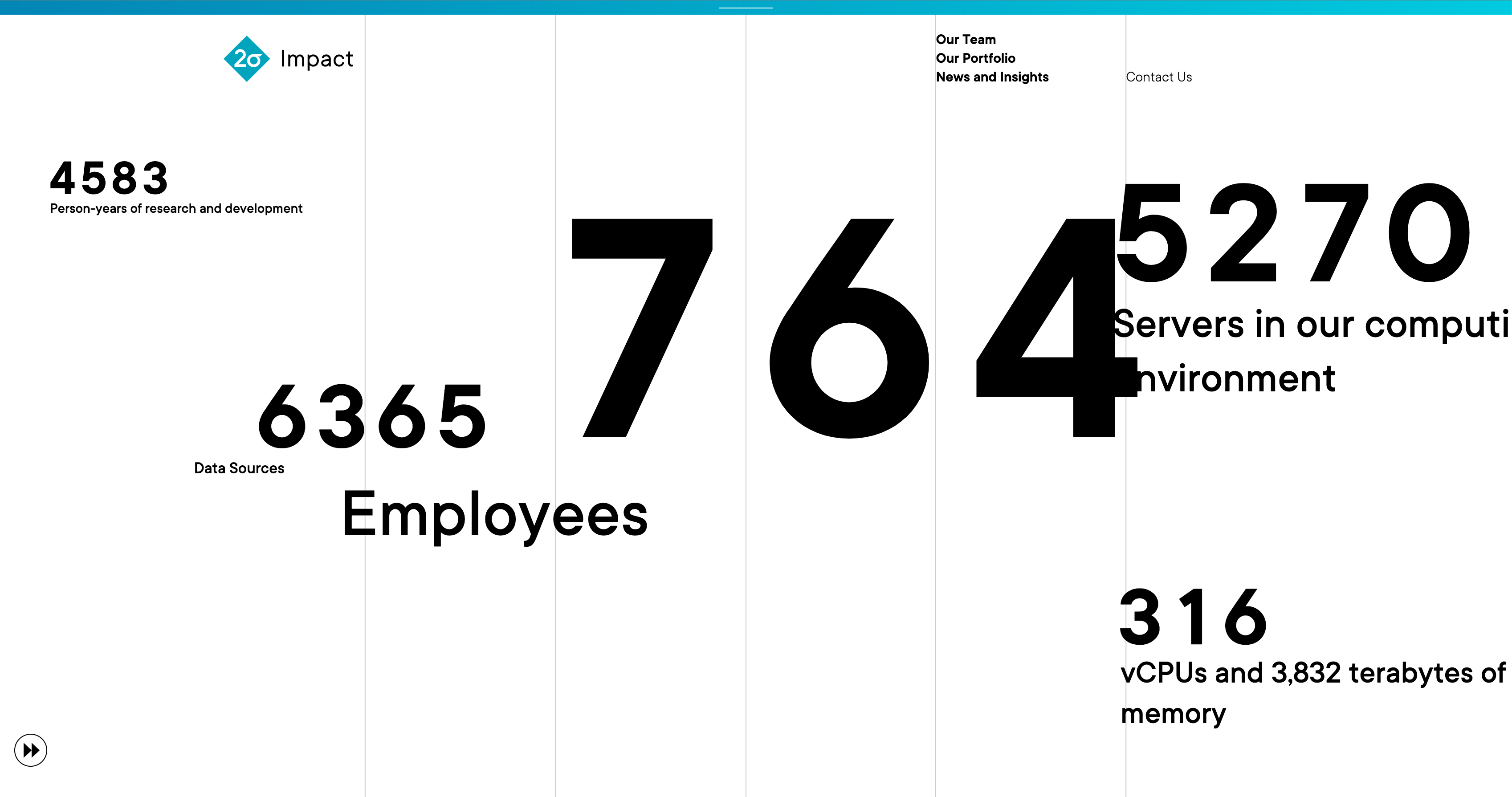
Key metrics — employees, data sources, servers — count up when they scroll into view. The numbers are CMS fields, so the same component runs anywhere on the site with new values and no code change.
Timeline Accordion
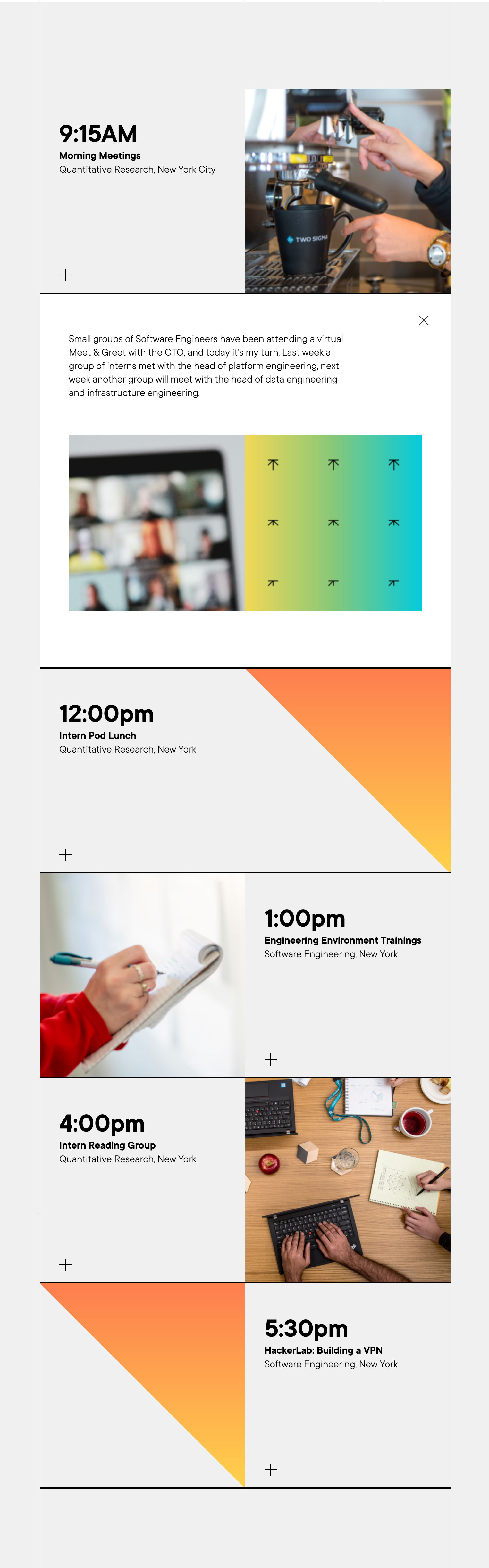
Time-stamped entries that expand in place, each holding text, images, and linked articles. Editors add and reorder them in the CMS.